
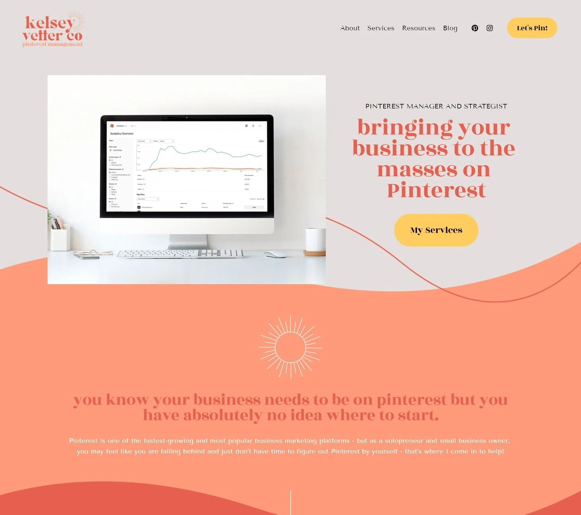
3 Simple Ways to Make Your Squarespace Website Less Boring
Let's be honest. Squarespace websites can often end up looking exactly the same: boring, one-dimensional, and not exciting to look at.
As a Squarespace designer myself, I too often feel like it's easy to feel stuck in the same block-like design pattern that most Squarespace websites end up having.
That being said, there are actually a ton of ways that you can utilize Squarespace as well as other tools to make your website more dynamic, easy to look at, and something that your customers will walk away from saying, “Ummm, best website EVER!”
In this post, I'm going to be walking through three simple ways that you can transform your Squarespace website using Squarespace and Canva tools that are super easy to learn and utilize for your website.
You will no longer cringe at your one-dimensional, bland website; rather, your brand will uniquely stand out and look professionally designed in just a few simple steps.
Using Squarespace’s New Dynamic Backgrounds
Squarespace 7.1 has just added a new Dynamic option to your background that you NEED to use now.

This allows you to add animation to your Squarespace background, instead of just having a stagnant photo that doesn't quite stand out.
When you open up Squarespace and navigate to editing a background on your Squarespace page, first you'll add whatever image that you like. I love that Squarespace connects with Unsplash, which provides amazing free stock photos, so definitely use those if you're struggling to find professional pictures that make your website look good.
After choosing your photo scroll down until you see the image effect option. Under this option there are a variety of effects that will impact the background of your photo. They add a little bit of animation to make what's on the foreground (probably your attention getters, important images, etc) stand out on your page.
My favorite image effect is Tilt because it doesn't distract the user too much, but adds a cool Parallax scrolling effect to your page and helps draw the user's attention towards the content on it.
Make sure to use these animations sparingly. I would recommend using no more than two on different background sections on each page of your website, just because a lot of animation can distract people and actually cause them to feel more overwhelmed on your website.

Adding Custom GIFs to Your Website
The next thing that I would recommend doing is adding some fun custom GIFs to some of your pages on your website.

But how do I make these gifs?
CANVA! As you all are probably aware of, Canva is an amazing tool that you can pretty much do anything you want on. And this includes making awesome custom gifts.
Simply go to Canva, make a document that has a few different image slides on it, choose the GIF option and export it - then just add it to your site!
Like I said, it's super simple to do and understand, but sometimes we just don't think about how we can add these cool pieces to our website.
GIFs draw people's attention, so make sure you put something important, like images, graphics, etc that you really want your user to pay attention to, on the slides. Again, just like the background animations, use GIFs sparingly. You don't want to overwhelm a user with thousands of GIFs on your website, so use it as a point of impression once or twice.
Use More Colors Throughout Your Website
Lastly, play with color on your website. Yes, even if you use minimal colors, you still want to incorporate different ones throughout your page.
Try to choose mostly lighter colors for your backgrounds to make your website easy on the eyes, and change the colors when you want to change the pace or direction of your content for your customer to easily follow.
Try playing with different title colors, text colors, border colors, etc throughout your pages to break up the monotony of just one or two colors being used.
These days, we have a short attention span, so having things change up on us (like different colors on a webpage) will keep users engaged and intrigued by what you're offering. It also helps break up different sections so everything doesn't run together in one single color.
As you can see, these tips are pretty simple and straightforward, but they can take your website from one-dimensional and boring to something exciting to look at and engage with.
I encourage you to just take one of these and implement it in your site today - and see what a difference it makes to how the site flows!
No more boring, generic websites that look like you just slapped a template on and left it.
Now's the time for a unique website that draws in your ideal clients, keeps their attention, and makes them want to work with you because you look unique, professional, and intentional.
Struggling with not know where to even start with designing your website - but you want one that stands out from the rest?
I would love to work with you on designing a website that stops your customers in their tracks and makes them want to buy from you INSTANTLY! Get ready to transform your website into one that you can be proud of :)